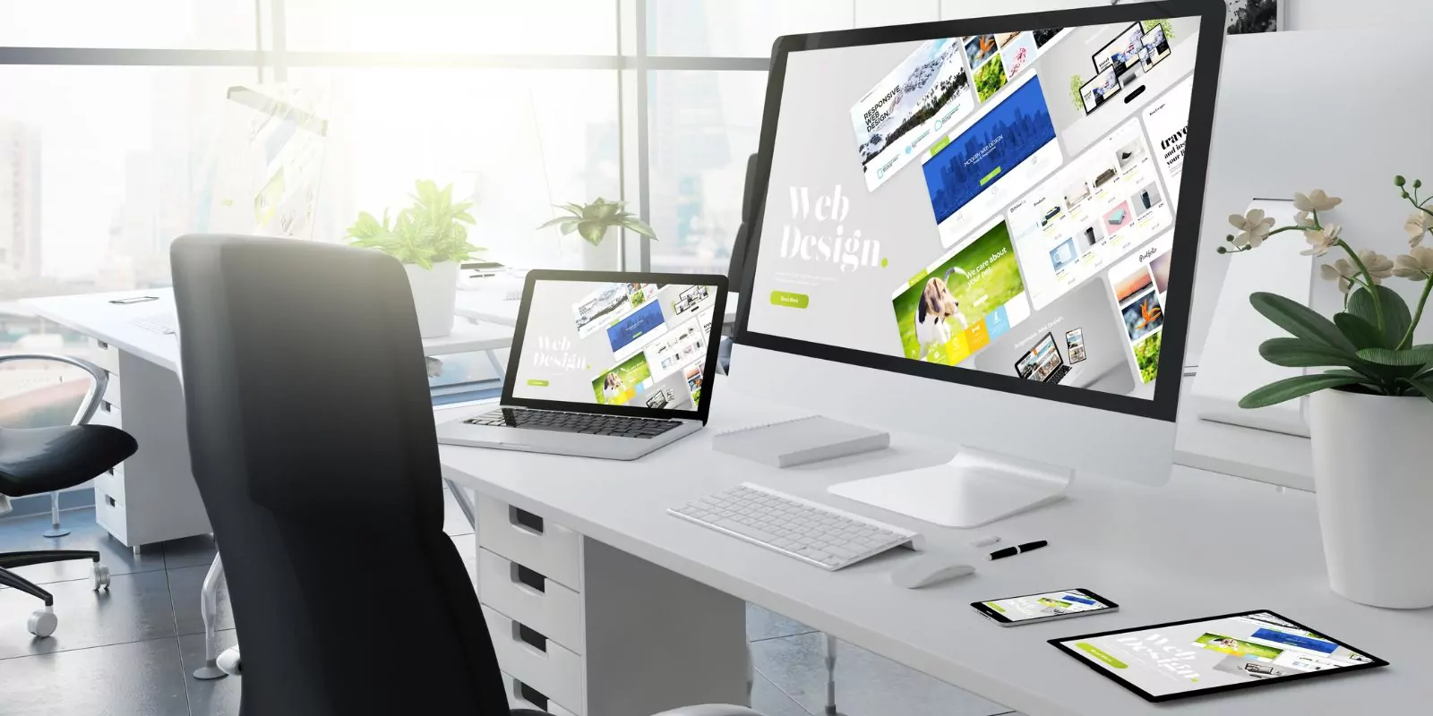
In today’s digital landscape, minimalist web design has emerged as a popular trend that prioritizes simplicity, functionality, and user experience (UX).
A study by Google found that users prefer simple and familiar designs, which are easier to navigate and understand.
This blog post explores the power of minimalism in web design and offers nine tips for creating clean and efficient designs that enhance the user experience.
1. Embrace White Space: Enhancing Focus and Clarity
White space, or negative space, refers to the empty areas surrounding content on a webpage. It plays a crucial role in creating a clean and efficient design by reducing visual clutter and enhancing readability.
According to Nielsen Norman Group, white space improves comprehension by up to 20%.
To effectively utilize white space in your design:
- Avoid overcrowding elements on the page
- Use consistent spacing between content blocks
- Balance white space with content to maintain visual harmony
2. Typography: Crafting Readable and Engaging Text
Typography is a fundamental aspect of minimalist web design that impacts readability, aesthetics, and brand identity.
A study by MIT found that good typography can improve reading time by approximately 7.45%.
To create an efficient design with effective typography:
- Select a maximum of two or three complementary fonts
- Use clear and legible font sizes for body text
- Employ typographic hierarchy to emphasize headings and key information
3. Visual Hierarchy: Organizing Content for Easy Navigation
Visual hierarchy is the arrangement of elements in a way that reflects their importance and guides users through the content.
A study published in Behaviour & Information Technology found that a well-structured layout can increase usability by 47%.
To establish a strong visual hierarchy:
- Prioritize essential content and place it prominently
- Use size, color, and contrast to differentiate elements
- Organize content in a logical and intuitive manner
4. Navigation Simplicity: Streamlining User Journeys
Minimalist web design prioritizes user experience by simplifying navigation and reducing cognitive load.

Award-Winning
Sales Funnel & Website Expert
Discover How My Agency Can Grow Your Business
- Website: Our websites are the perfect blend of form and function.
- Sales Funnel: We build sales funnels that turn leads into customers.
- SEO: Get found online with our expert SEO services.
According to Forrester Research, a well-designed navigation can increase conversion rates by up to 200%.
To create a user-friendly navigation:
- Limit the number of menu items for quick decision-making
- Employ clear and descriptive labels for menu options
- Ensure consistent navigation across all pages
5. Color Palette: Conveying Emotion and Brand Identity
Color is a powerful tool that can evoke emotions, reinforce brand identity, and guide users’ attention.
A study by the University of Toronto found that using a simple color palette can improve users’ ability to process and retain information.
To create a minimalist color palette:
- Choose two or three primary colors that align with your brand identity
- Use contrasting colors for text and background to ensure readability
- Incorporate neutral colors for balance and visual harmony
6. Responsive Design: Adapting to Different Devices and Screen Sizes
Responsive design is essential for creating a consistent and accessible user experience across various devices and screen sizes.
A report by Statista revealed that mobile devices account for over half of all web traffic worldwide.
To create a responsive and efficient design:
- Use fluid grids and flexible images to adapt to different screen sizes
- Implement mobile-first design principles for better performance
- Test your design on multiple devices and browsers to ensure compatibility
7. Content Prioritization: Highlighting Key Information
Focusing on the most important content is vital in minimalist web design, as it helps users quickly find the information they need.
A study by the Poynter Institute found that content prioritization can increase user satisfaction by up to 27%.
To prioritize content effectively:
- Identify your target audience’s needs and preferences
- Showcase essential information, such as calls to action, prominently
- Remove unnecessary or redundant content that distracts from the main message
8. Page Load Time: Enhancing User Experience and Retention
Fast-loading web pages are critical for maintaining user engagement and reducing bounce rates.
According to Google, a one-second delay in page load time can lead to a 20% decrease in conversion rates.
To optimize your minimalist web design for faster load times:
- Compress images and use web-optimized formats
- Minify CSS, JavaScript, and HTML files
- Utilize browser caching and content delivery networks
9. Flat Design: Simplifying Visual Elements for Greater Efficiency
Flat design is a minimalist design approach that emphasizes simplicity, usability, and clarity by using two-dimensional elements and minimal visual effects.
Incorporating flat design principles can help create a clean and efficient website that prioritizes user experience.
To implement flat design in your minimalist web design:
- Use simple shapes and geometric forms
- Avoid gradients, shadows, and other visual effects that add complexity
- Incorporate clear and straightforward iconography
Frequently Asked Questions
Why is minimalist web design important?
Minimalist web design is important because it helps enhance usability and ensure a better user experience. By eliminating unnecessary elements, it creates a simple, clean, and focused environment that’s easy to navigate. This clarity helps visitors quickly understand your site’s purpose, find the information they need, and take desired actions. Additionally, minimalist websites tend to load faster and perform better in terms of SEO.
What is minimalism in UI design?
Minimalism in UI design refers to a design style where the focus is on the essential content and functionality, eliminating unnecessary elements. The aim is to create a user interface that’s simple, clean, and easy to understand. Key characteristics include generous use of whitespace, restricted color palettes, simple typography, and the principle that less is more.
How do I make my website minimalistic?
To make your website minimalistic:
- Focus on Essential Elements: Remove any unnecessary elements and keep only what is critical for the users.
- Use Whitespace: Use generous amounts of whitespace to create visual breathing room and help focus on the key content.
- Limit Colors: Stick to a simple and restrained color palette.
- Use Simple Typography: Opt for clean, readable typefaces.
- Simplify Navigation: Make sure your site navigation is straightforward and intuitive.
What are the 3 characteristics of minimalism?
The three main characteristics of minimalism are:
- Simplicity: This involves a clean, uncluttered design with a focus on essential elements.
- Functionality: Every element serves a purpose. There’s nothing superfluous in minimalist design.
- Subtracting until it breaks: Keep removing elements until you’re left with only the essential ones that, if removed, would compromise the functionality of the design.
What is the 90 rule of minimalism?
The 90 rule of minimalism, also known as the 90/90 rule, suggests that if you haven’t used something in the last 90 days and you don’t anticipate using it in the next 90 days, then you should let go of it. In the context of web design, this could mean removing any elements, features, or content that doesn’t serve a purpose or contribute to user experience within a given timeframe.
What are the characteristics of minimalism in web design?
In web design, minimalism often involves:
- Simple, Functional Navigation: Navigation menus are clear, concise, and straightforward.
- Flat Textures and Patterns: Designs tend to be flat, avoiding complex textures, gradients, or shadows.
- Limited Color Scheme: Minimalist designs often stick to a limited color palette, often with neutral background colors.
- Use of Whitespace: Plenty of space is left empty to allow elements to breathe and to avoid clutter.
- Simplified Content and Imagery: Content and imagery are pared down to their simplest form – only what is necessary is included.
- Bold Typography: Minimalist designs often leverage bold, straightforward typography to convey messages.
Conclusion
By following these 9 tips, you can harness the power of minimalism in web design and create clean, efficient, and user-friendly websites that prioritize user experience and cater to the needs of your target audience.
Embrace the minimalist approach to enhance your web design projects and reap the benefits of improved usability, faster load times, and increased user satisfaction.


