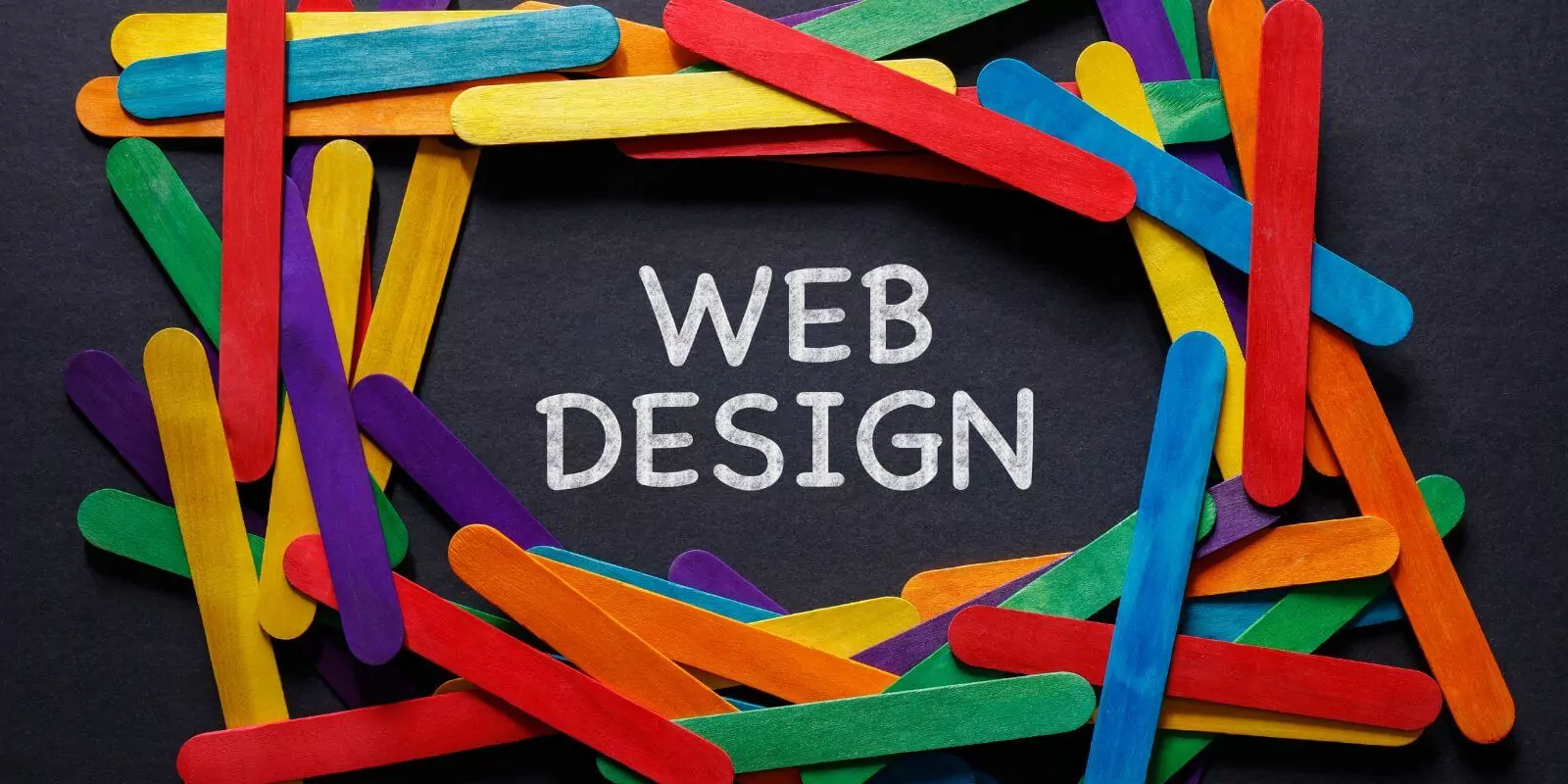
Color psychology plays a crucial role in web design, as it has a profound impact on users’ emotions and perceptions.
Colors can evoke feelings, influence decision-making, and contribute to a memorable brand identity.
In fact, a study found that up to 90% of initial judgments about products are based on color alone.
With this in mind, let’s dive into the role of color psychology in web design and how to choose the perfect color palette for your site.
1. Understanding Color Psychology and Its Impact on Emotions
Color psychology explores the emotional impact of colors on human behavior and how they can influence our actions.
Different colors can evoke various emotions and associations.
For example, red is often associated with passion, energy, and urgency, while blue is linked to trust, calmness, and professionalism.
When selecting colors for your website, it’s essential to consider the emotions you want to convey and how they align with your brand identity.
2. Creating a Memorable Brand Identity through Color Palette
A cohesive and well-chosen color palette can help establish a strong brand identity and make your website memorable.
Research suggests that using a consistent color scheme can increase brand recognition by up to 80%.
To create a color palette that supports your brand, consider the emotions and values you want to communicate and choose colors that reflect these attributes.
3. Enhancing User Experience (UX) with Color Choices
The colors you choose for your website can significantly affect the overall user experience (UX).
For instance, 62-90% of a user’s first impression of a website is based on color alone.
By selecting a visually appealing and harmonious color palette, you can create a more enjoyable browsing experience for your audience, ultimately encouraging them to stay longer on your site and engage with your content.
4. Improving Conversion Rates with Strategic Color Selection
Color psychology can also play a role in improving conversion rates.
Certain colors are more likely to encourage users to take action, such as clicking on call-to-action (CTA) buttons.
One study found that changing a CTA button color to red increased conversions by 21%.
It’s essential to test different color combinations to determine which colors are most effective for driving conversions on your website.
5. Establishing Visual Hierarchy through Color Contrast and Harmony
Using color contrast and harmony can help create a clear visual hierarchy on your website, making it easier for users to navigate and find information.
According to the Web Content Accessibility Guidelines (WCAG), a minimum contrast ratio of 4.5:1 is recommended for text and images to ensure readability for users with visual impairments.

Award-Winning
Sales Funnel & Website Expert
Discover How My Agency Can Grow Your Business
- Website: Our websites are the perfect blend of form and function.
- Sales Funnel: We build sales funnels that turn leads into customers.
- SEO: Get found online with our expert SEO services.
Additionally, using complementary colors can create a balanced and harmonious design that is visually appealing and easy to navigate.
6. The Importance of Color Theory in Web Design
Color theory provides a framework for understanding how colors interact and how they can be combined effectively.
This includes concepts such as color wheel, primary, secondary, and tertiary colors, as well as color schemes like monochromatic, analogous, and triadic.
Familiarizing yourself with color theory can help you make informed decisions when selecting a color palette for your website.
7. Prioritizing Accessibility in Color Selection
Approximately 4.5% of the global population has some form of color vision deficiency.
To create an inclusive and accessible website, it’s crucial to choose colors that can be easily distinguished by users with color vision impairments.
This may involve using high-contrast color combinations and providing alternative text for images and icons that rely on color to convey information.
8. Considering Cultural Associations of Colors
Different cultures may have unique associations with colors, which can influence how your website is perceived by users from diverse backgrounds.
It’s essential to research the cultural associations of your chosen colors and ensure they align with your target audience’s expectations and values.
9. Designing Effective Call-to-Action (CTA) Buttons with Color
Color plays a crucial role in the effectiveness of call-to-action (CTA) buttons on your website.
Choosing the right color for your CTA buttons can help them stand out and encourage users to take the desired action.
Studies show that CTA buttons with high color contrast to the background can increase conversion rates by up to 32.5%.
Experiment with different colors and contrasts to find the most effective combination for your website’s CTA buttons.
10. Achieving Color Harmony in Web Design
Color harmony refers to the aesthetically pleasing combination of colors that create a sense of balance and unity in a design.
To achieve color harmony on your website, consider using color schemes based on the color wheel, such as complementary, analogous, or triadic color schemes.
These schemes can help you create a visually appealing and cohesive design that enhances user experience and strengthens your brand identity.
Frequently Asked Questions
What is color psychology in web design?
Color psychology in web design refers to the study of how different colors can influence people’s perceptions and behaviors when they interact with a website. It’s a crucial aspect of web design because different colors can evoke different emotions and reactions.
For example, red can symbolize urgency or importance, while blue often represents trust and stability. A thorough understanding of color psychology can aid designers in creating more effective and impactful designs that align with a brand’s message and goal.
How do colors affect web design?
Colors have a significant impact on web design. They can:
- Affect Mood and Emotions: Different colors can evoke different feelings. For example, blue can evoke feelings of calm and trust, while yellow might evoke happiness and positivity.
- Highlight Important Elements: Using contrasting colors can draw attention to key parts of a website, like call-to-action buttons or special offers.
- Create Visual Hierarchy: Colors can be used to guide users through a website, helping them focus on the most important elements first.
- Reinforce Brand Identity: Colors that align with a brand’s logo or existing color scheme can reinforce brand recognition and consistency.
What is color psychology in UI design?
Color psychology in UI design is the use of color in user interfaces to influence user behavior and decision-making. Understanding color psychology allows UI designers to use specific color combinations to elicit certain reactions and emotions from users, enhancing usability and user experience. This can be particularly important in areas such as call-to-action buttons, menu navigation, and error notifications.
What colors attract people to your website?
Colors that attract people to your website can vary widely based on the intended audience, the nature of the business, and cultural factors. However, colors associated with positivity and trust, such as blue, green, and purple, are generally well-received. Warm colors like red, orange, and yellow can create a sense of urgency or enthusiasm, while cool colors like blue and green can convey a sense of calm and reliability.
What color grabs attention the most?
Bright and bold colors like red and orange are often most effective at grabbing attention. They are highly visible and can evoke strong emotions. However, the most attention-grabbing color can also depend on its contrast with surrounding elements. A color that strongly contrasts with its background will stand out more and thus grab more attention.
What is the color rule on websites?
One common color rule for websites is the 60-30-10 rule, which suggests that you should divide the colors on your website into three parts: 60% for the dominant hue, 30% for the secondary color, and 10% for the accent color. This rule helps achieve a balanced, visually pleasing color scheme. Also, it’s essential to ensure sufficient color contrast for readability and accessibility, and consistency with the brand’s color palette for brand identity and recognition.
Conclusion
In conclusion, understanding color psychology and its impact on web design is essential for creating a visually appealing and user-friendly website.
By carefully selecting your color palette, considering emotional impact, brand identity, user experience, conversion rates, visual hierarchy, and cultural associations, you can craft a website that resonates with your audience and supports your business goals.
As you embark on your web design journey, remember to prioritize accessibility, apply color theory principles, and strive for color harmony.
By doing so, you can create a website that not only looks great but also effectively engages and connects with your users.


